
NEGA
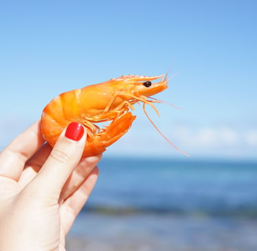
Fresh Catch
Sustainable Sourcing
Coastal Craft
Taste the Ocean — From Boat to Table
Project Overview
NEGA arrived on the scene as a company blending time-honored fishing traditions with modern retail practices.
The brief was clear: build a visual identity that instantly communicates product quality — freshness, traceability, and respect for the sea — while working seamlessly across contexts: from a bustling fish stall at the harbor to a premium delicatessen shelf in the city. The challenge was to translate the tactile, sensory world of the coast into a simple, memorable visual language.
The Brief
The Concept
Create a coherent brand system that:
communicates the category at a glance (fish, shrimp, seafood);
evokes freshness, provenance, and maritime authenticity;
remains highly legible and recognisable in minimal form across packaging, labels, delivery materials and digital channels.
This was not about a single emblem — it was about a flexible mark that acts as a trust signal for quality seafood.
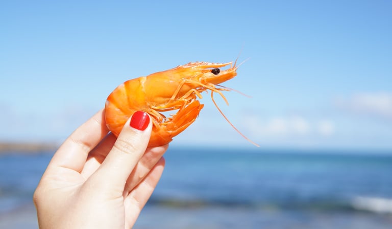
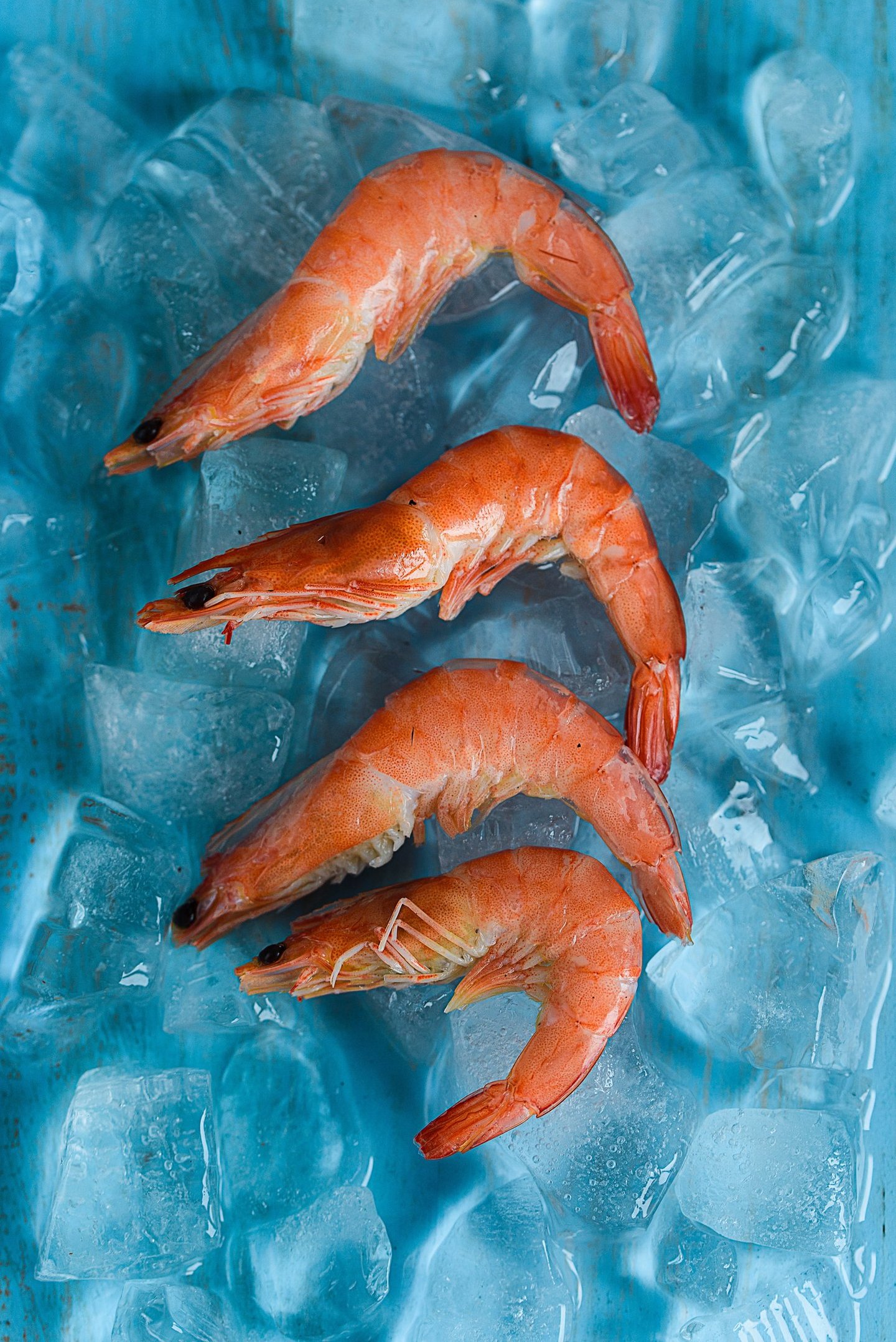
We grounded the concept in direct, sensory contrasts: the warm, appetizing tones of coral and salmon against the cool, stabilising blues of the sea. This palette balances culinary appeal and environmental context — food that looks delicious and a supply chain that looks responsible.
Minimalism became the main design strategy. A pared-down silhouette — a fish that can also read as a shrimp in different contexts — makes the mark instantly legible and iconic. The simplified form cuts through the clutter of overloaded packaging and creates an emblem that scales cleanly: tiny on a sticker, bold on a crate.
Beyond the mark, the identity is built to tell a short, reassuring story at every touchpoint: where the product came from, when it was landed, and how best to prepare it.

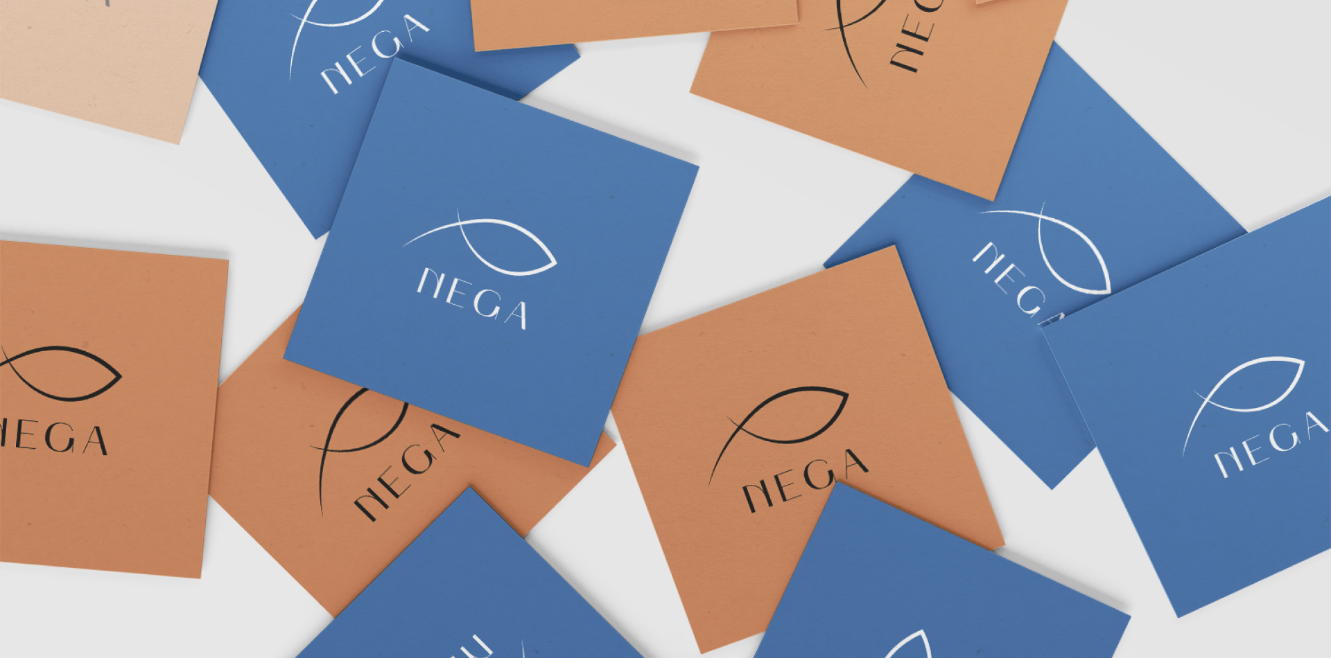
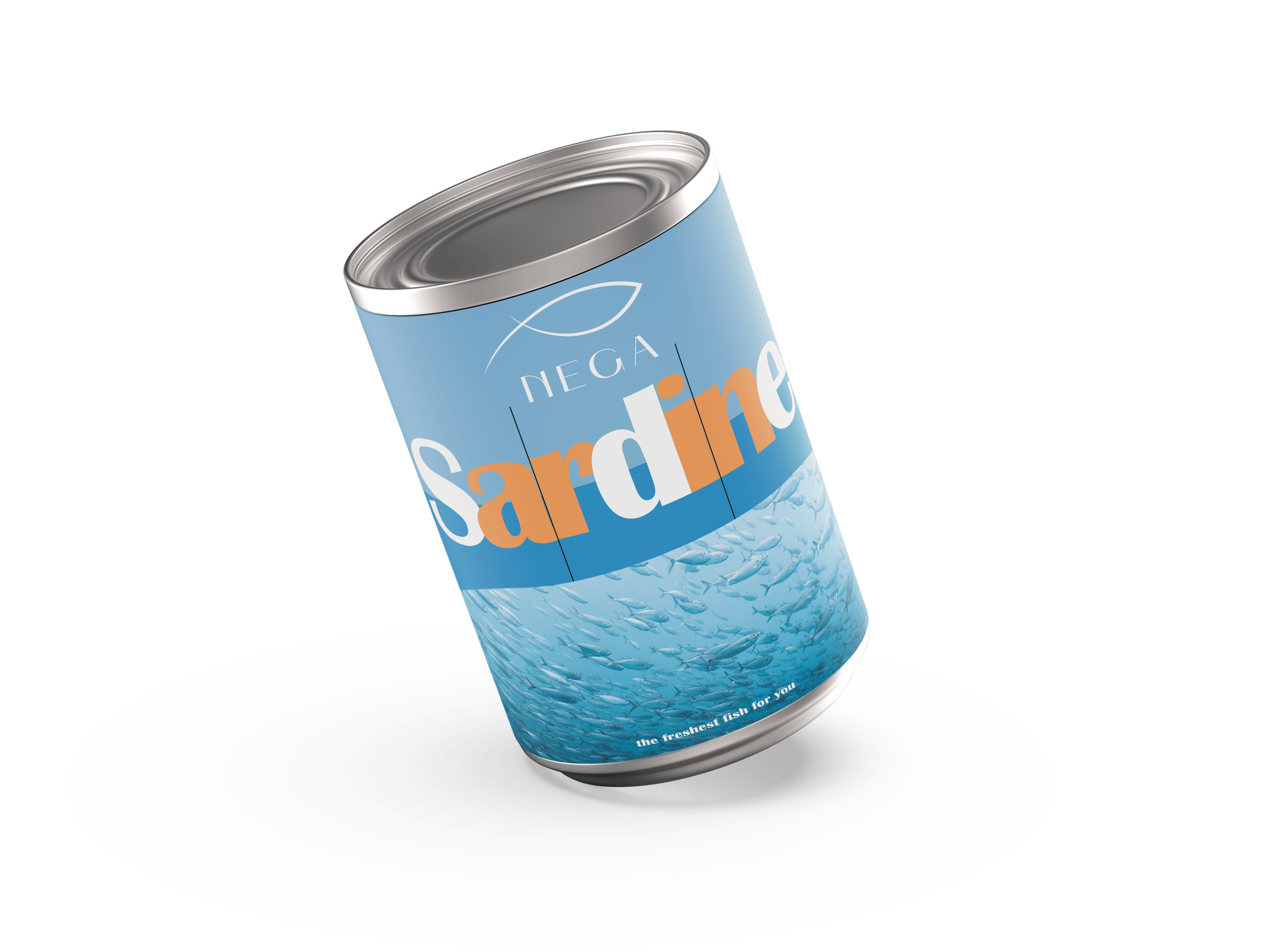
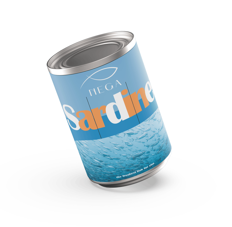
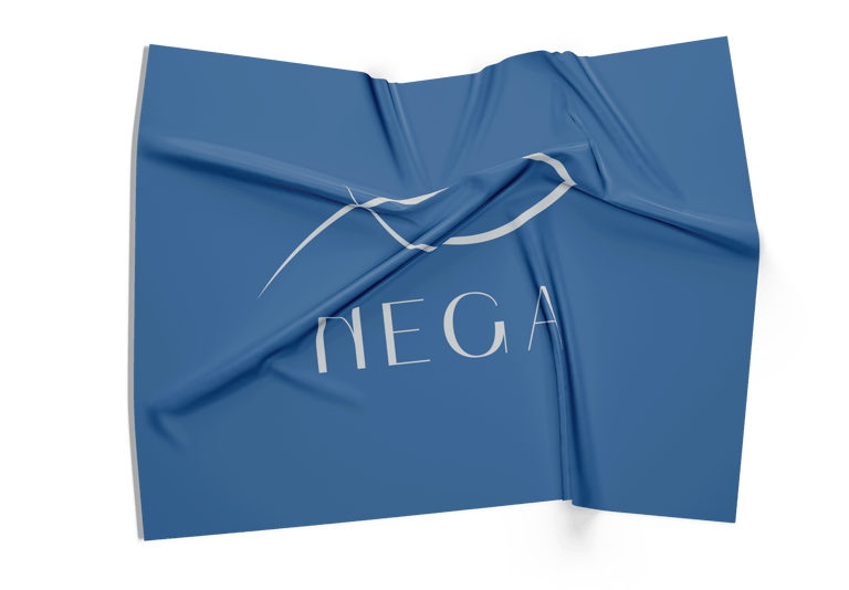
The Mark & Logotype
Emotional Positioning
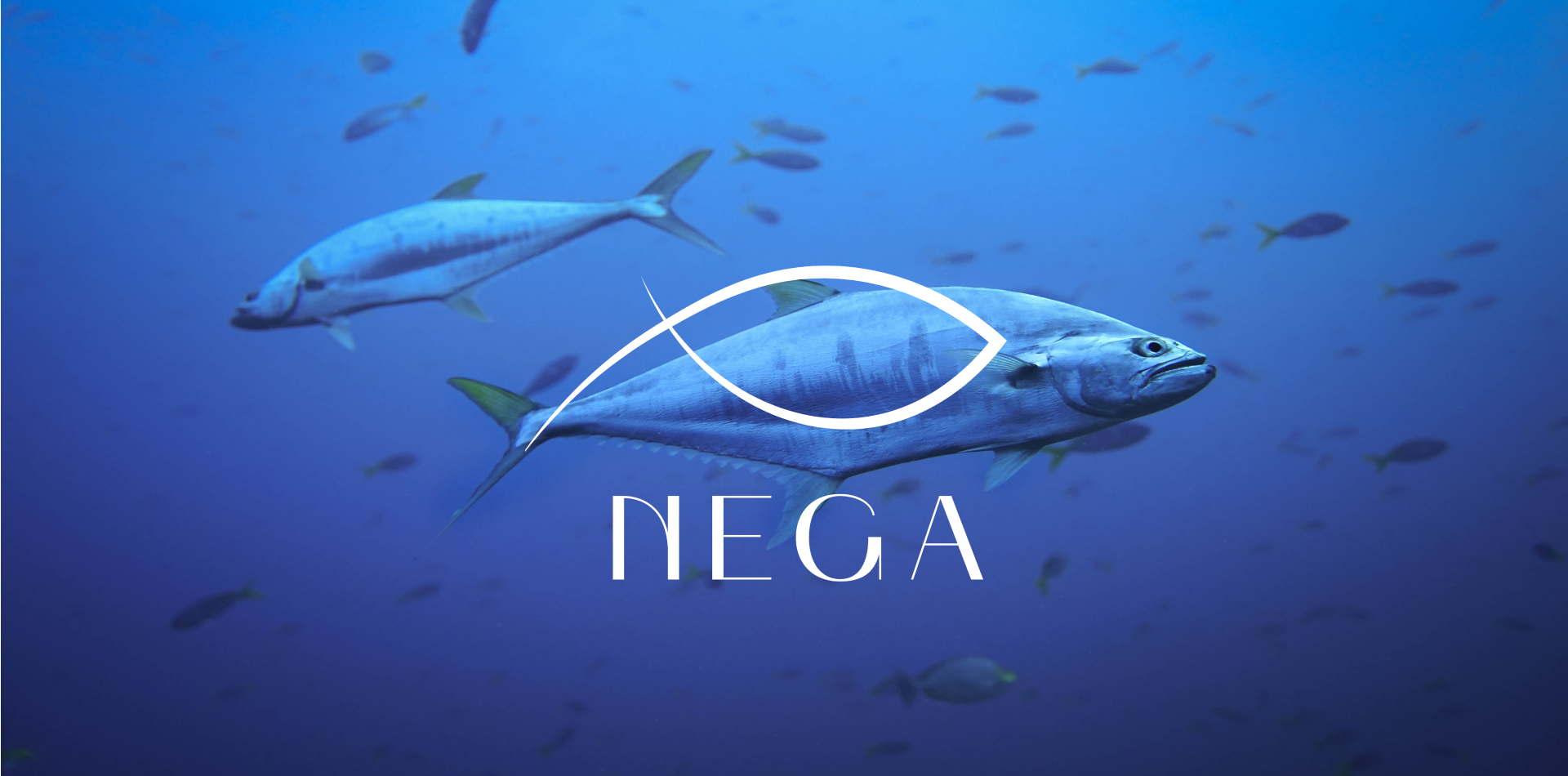
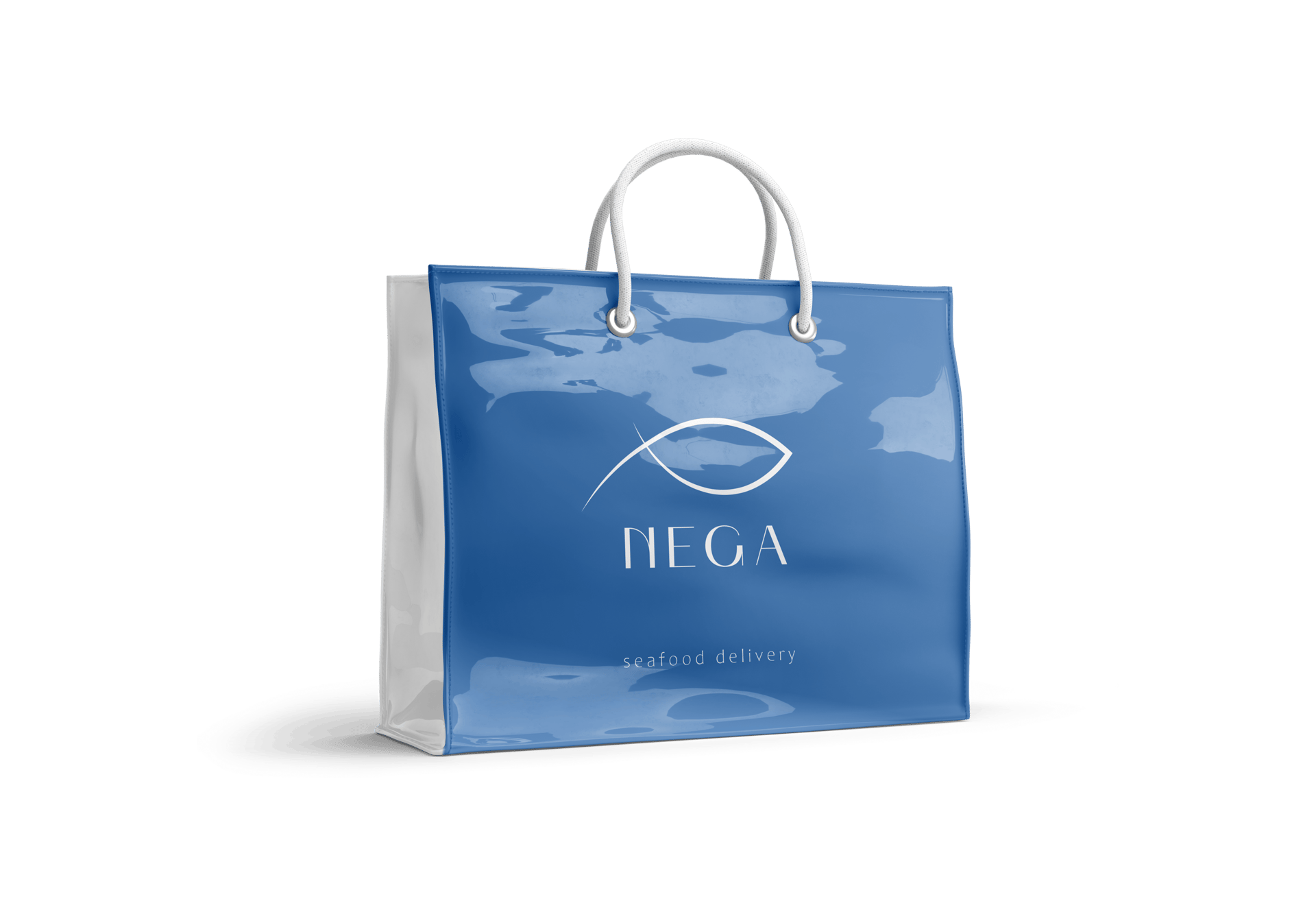
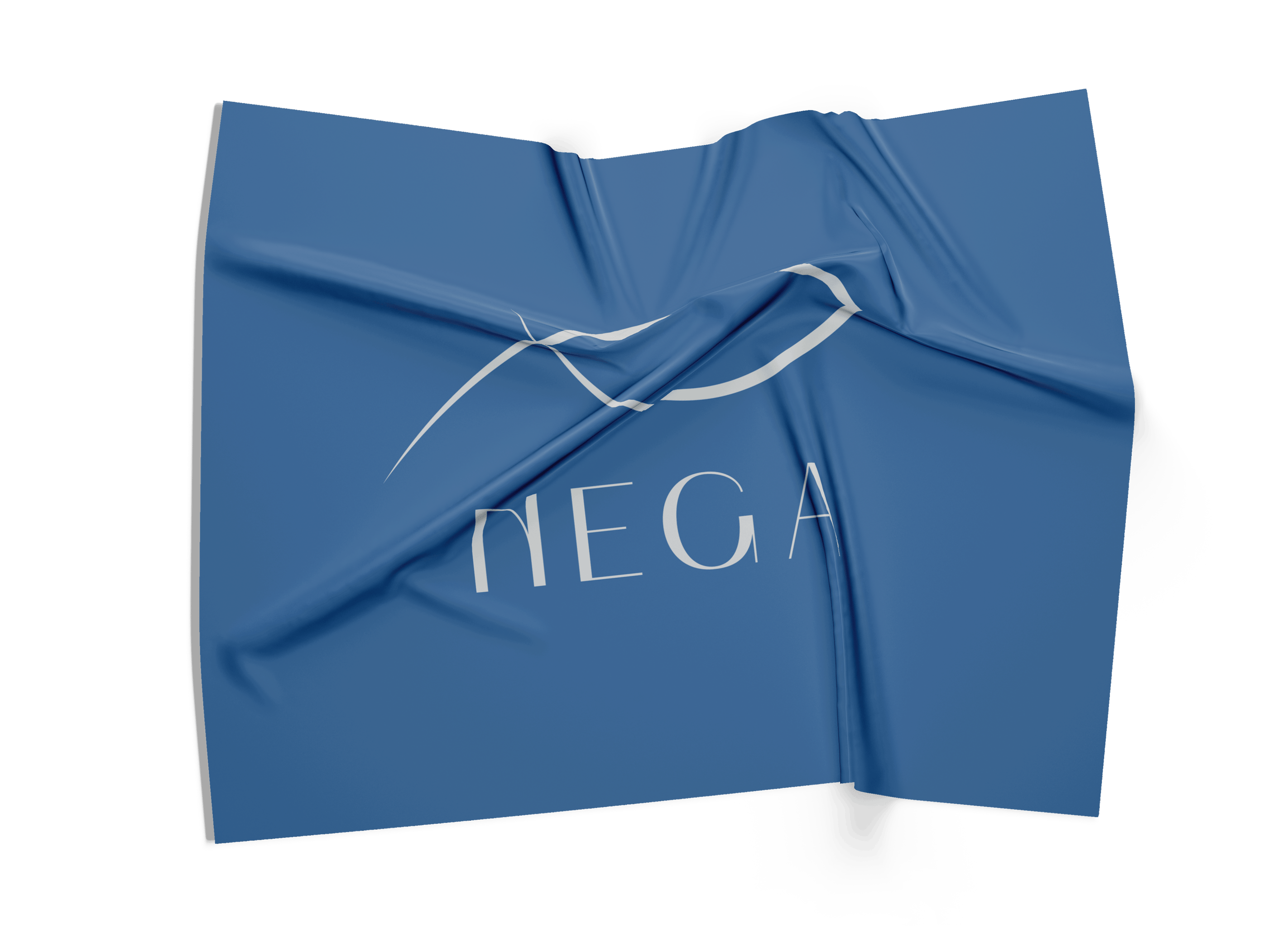
The logo is a single, flowing line that suggests both fish and crustacean: an economical, memorable shape that plays with positive and negative space. The line rhythm was tuned to read clearly at very small sizes and retain personality at large formats.
The wordmark uses a restrained, geometric sans that communicates professional reliability and modernity. Together, mark and type create a balance between craft and scale — a small-boat sensibility with industrial reliability.
In some applications, the mark is framed inside a circular badge that evokes nets, boat hatches, or the overhead view of a ring of life at sea — a subtle narrative device that anchors the product’s origin story.
The brand speaks plainly and respectfully to buyers who value provenance and taste. It positions seafood as something to be chosen knowingly — not mass-commodified, but responsibly sourced and delicious. The slogan “Taste the Ocean — From Boat to Table” reframes each purchase as participation in a chain: fisher → handling → consumer.
This emotional thread—honesty, clarity, appetite—turns routine shopping into a small ritual of trust.
Visual System & Applications
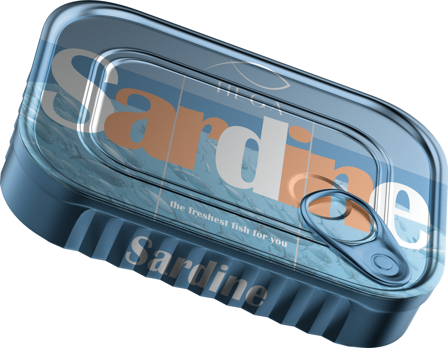
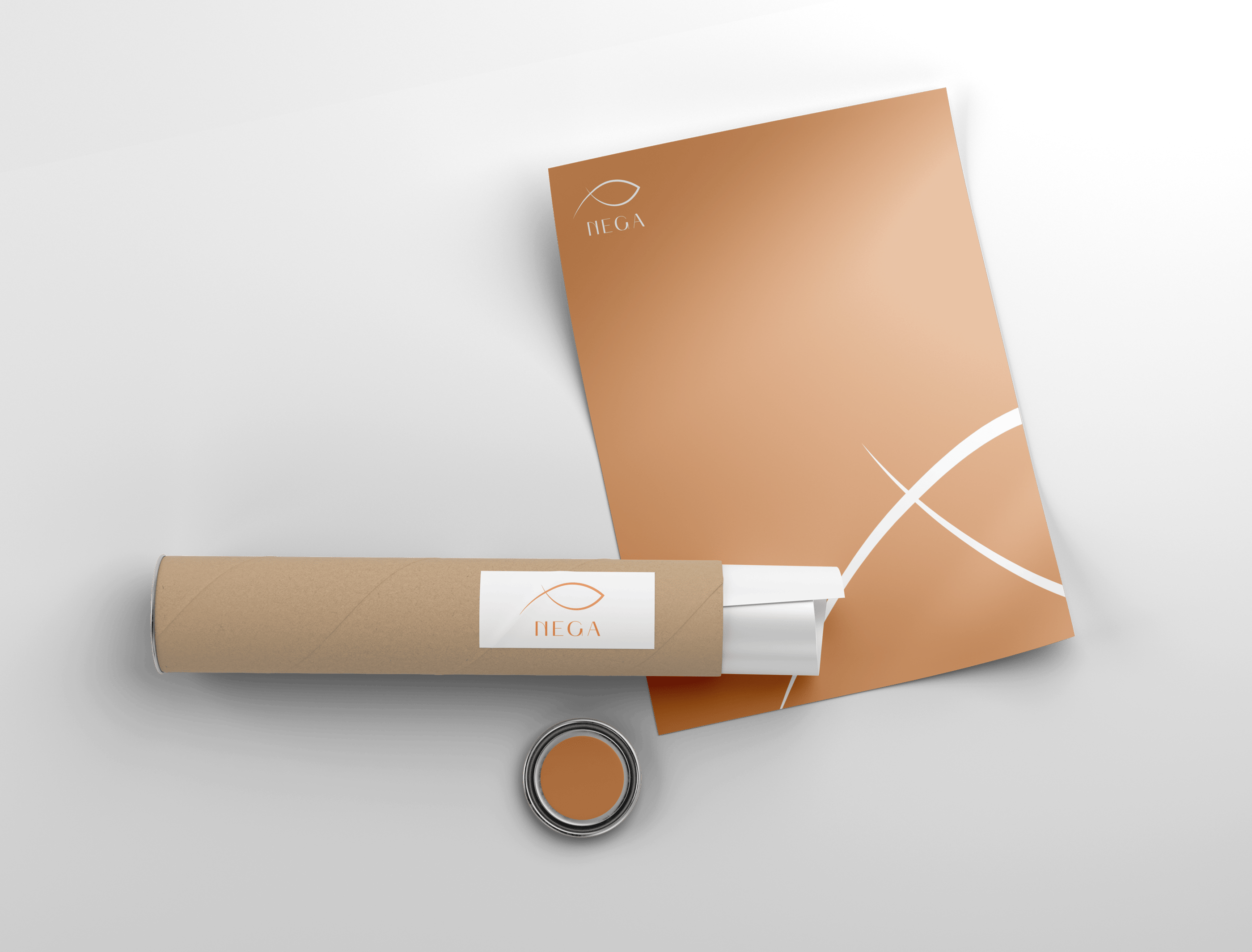
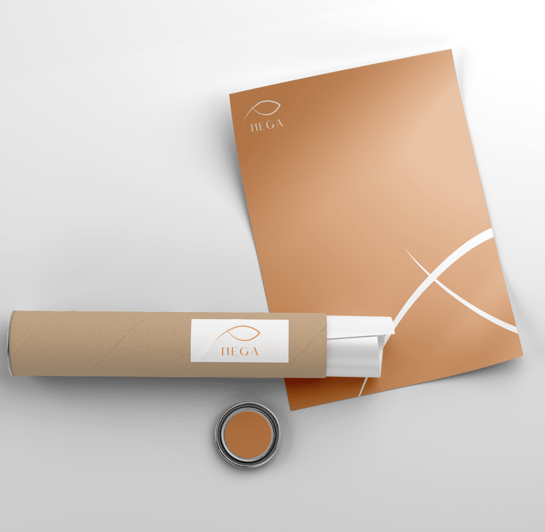
Practicality shapes every decision in the system. A modular label grid reserves the top area for the mark and product name, with a clear lower band for provenance data: catch date, vessel or farm, and handling instructions. This grid makes it easy for staff to apply information consistently and for customers to find the facts they care about.
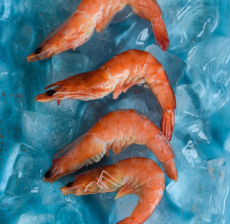
Material choices reinforce authenticity: matte, recycled carton with a localized gloss on the mark, waterproof labels for chilled packs, and tactile stickers that feel like a seal of freshness. Patterns made from repeated silhouettes function as backgrounds for bags, aprons, and in-store panels without competing with product photography. Large-format imagery uses high-detail shots of ice, scales, and sea textures to carry the sense of immediacy and cold-chain integrity.
Digital touchpoints incorporate quick-scan QR stickers that open to harvest stories, certifications, and recipes — transparency that builds trust and encourages repeat purchase.
The Outcome
The result is a practical, distinct identity that converts on shelf and resonates online. The mark is instantly recognisable, the palette makes products look appetising and authentic, and the system supports operational needs from labeling to retail display. Most importantly, the brand functions as a guarantee: see the sign, know the source, buy with confidence.
NEGA now carries a visual promise: a simple emblem that signals fresh catch, a clear story about origin, and a design built to sell — whether on the quay, in a market, or in a curated gourmet cabinet.


Ready to shape your visual identity?
© 2026 Leap Weasel