

W
Where thought becomes form, and form becomes legacy.
In these pages begins the quiet transformation of idea into structure. What is first conceived in reflection is shaped through proportion, disciplined by intention, and brought forth as a living system.
We work at the point where reasoning acquires geometry — where clarity governs aesthetics, and meaning precedes ornament.
Brand Strategy. Visual Identity. Bespoke Type Design.
Composed for companies who value coherence over noise, substance over spectacle, and endurance over momentary fashion.
Each engagement is approached as an editorial undertaking: the subject examined, its thesis defined, its visual language articulated with measure and restraint.
Here, marks are not decorative signatures, but emblems of conviction. Type is not merely read — it speaks with character. Systems are not assembled — they are constructed.
For founders, institutions, and cultural ventures who understand that legacy is not declared — it is designed.
We compose brands as one would compose a classical work —with harmony, proportion, and deliberate grace.
Each identity is born from dialogue: between thought and form, typography and silence.
We believe design is not ornament, but intellect made visible. By removing the unnecessary, we reveal what is essential — a brand so precise it feels inevitable, as though it had always existed.
In an age of excess, we choose measure. In a world that shouts, we speak softly — and are heard.
Where reason shapes beauty, and restraint becomes luxury.
THE MANIFESTO
Brand Strategy & Identity

Logo & Visual Systems
A brand is first an argument — then a presence.
We define its position, articulate its voice, and construct the system through which it is recognized. Strategy establishes meaning; identity gives it form. What emerges is not a collection of elements, but a coherent structure designed to endure across markets and mediums.
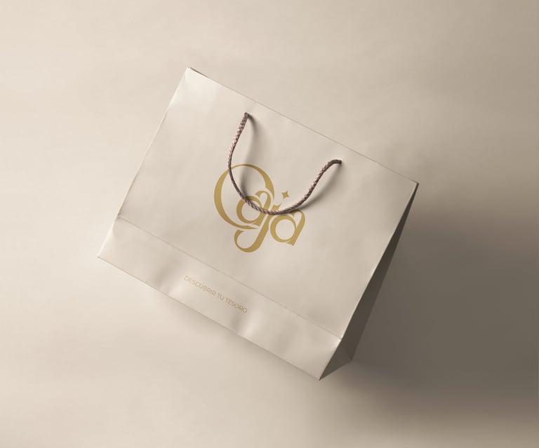
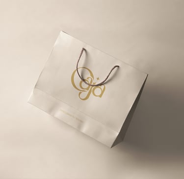
The Atelier
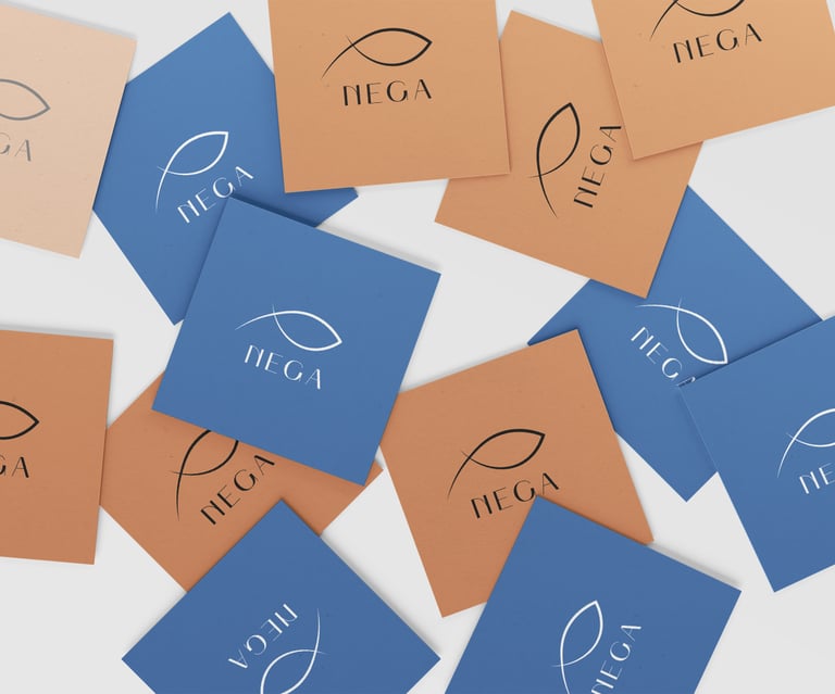
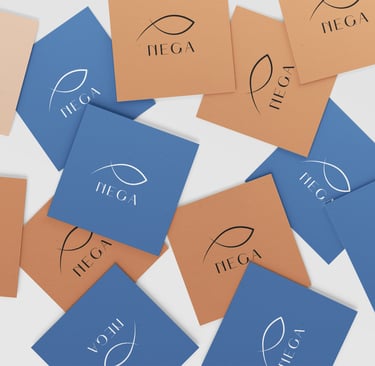
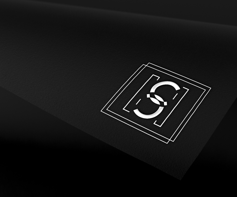
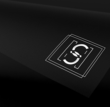
A mark alone is insufficient. It must belong to an order.
We design emblematic forms supported by proportion, hierarchy, and visual language. Each component — symbol, color, typography, composition — functions within a unified framework, ensuring consistency from the smallest application to the broadest public expression.
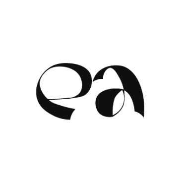
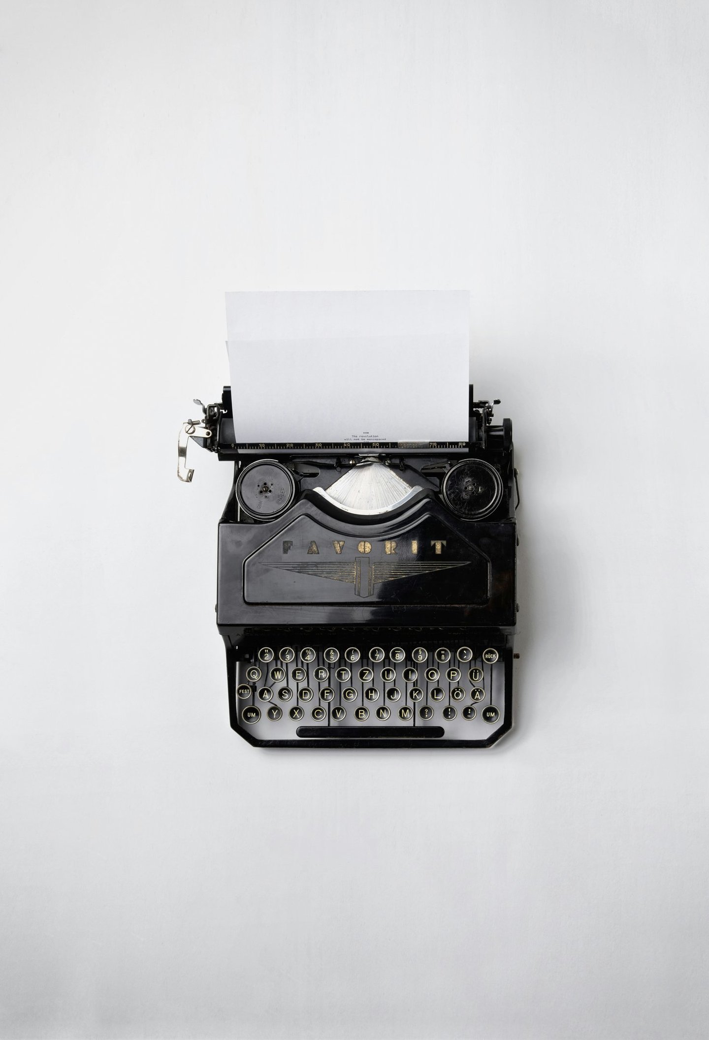
Bespoke Typeface & Type Design
Music Album & Cover Art
Sound acquires its first impression through sight.
We conceive album and cover art as composed narratives — visual interpretations aligned with tone, rhythm, and intention. The result is not mere packaging, but a complete visual accompaniment prepared for both digital platforms and physical editions.
Letterforms carry temperament.
We design custom typefaces that embody the character of a brand — measured or expressive, restrained or declarative. Every curve, weight, and interval is drawn with precision, resulting in a typographic voice that is unmistakable and enduring.

Selected Works
Features
II. Formulation
Structure, proportion, and intent are established.
III. Execution
The design is carried out with discipline and care.
IV. Refinement
Excess is removed, balance is restored.
Our method is neither improvised nor hurried. It proceeds in ordered stages — from examination to formulation, from execution to refinement — each undertaken with measured attention. Inquiry defines the thesis; structure gives it coherence; discipline ensures its endurance.
Every decision is tested against intention. What does not serve the whole is removed. What strengthens clarity is retained. Thus the work advances with steadiness, until concept and form stand in rightful balance.
V. Completion
The work is delivered in its final and proper state.


I. Consideration
The subject is examined and its limits defined.
OUR PROCESS
Our Process
Remarks
“From the first exchange, it felt like we were understood. Not just what we needed to look like, but who we were trying to become.”
– Anja Müller, Founder, Berlin
“I wanted the cover to feel honest, not decorative. What Leap Weasel delivered matched the music more closely than I expected.”
– Carlos García, Creative Director, Madrid
“The custom typeface changed the way we speak visually. It’s subtle, but once you see it, everything else feels less considered.”
“Correspondence was measured, decisions deliberate,
and the outcome exact.
The process itself inspired confidence.”
- Ayumi Nakamura, Startup Founder
- Private Client (at their request)
All commissions are approached with discretion and seriousness of purpose. Scope, timelines, and expectations are defined at the outset to preserve clarity throughout the engagement.
We welcome collaborations across borders and disciplines, and prepare our work for international application in language, format, and production standards.
For detailed proposals, investment ranges, or partnership inquiries, correspondence is invited.
On Identity and Form
On Visual Expression
On the Manner of Work
On Typography and Discipline

Ready to shape your visual identity?
© 2026 Leap Weasel